Calculating and visualizing error bars for within-subjects designs
What this post is about
Personally, I find violin plots with error bars a great way to present repeated-measures data from experiments, as they show the data distribution as well as the uncertainty surrounding the mean.
However, there is some confusion (at least for me) about how to correctly calculate error bars for within-subjects designs. Below, I present my learning process: First, how I’ve calculated the wrong error bars for a long time. I explain why these error bars are wrong and end with calculating and visualizing them correctly (I hope…).
If you’re not interested in the learning process, feel free to immediately go to the final header.
This post closely follows the logic outlined by Ryan Hope for his Rmisc package here.
UPDATE: Thanks to Brenton Wiernik who pointed out that the Morey method described below is not without criticism. I’ll update this post soon.
Creating data
Alright, let’s create a data set that has the typical structure of an experiment with a within-participants factor and multiple trials per factor level.
In this case, we create a data set with 30 participants, where each participant gives us a score on three conditions. Say there are trials as well, with each participant providing ten scores per condition.
We start with defining the parameters for our data set: how many participants, the names of the three conditions (aka factor levels), how many trials (aka measurements) each participant provides per condition, and the means and standard deviations for each condition. We assume participants provide us with a score on a scale ranging from 0 to 100.
set.seed(42)

library(Rmisc)
library(tidyverse)
library(truncnorm)
# number of participants
pp_n <- 30
# three conditions
conditions <- c("A", "B", "C")
# number of trials (measures per condition per participant)
trials_per_condition <- 10
# condition A
condition_a_mean <- 40
condition_a_sd <- 22
# condition B
condition_b_mean <- 45
condition_b_sd <- 17
# condition C
condition_c_mean <- 50
condition_c_sd <- 21Okay, next we generate the data. First, we have a tibble with 30 rows for each of the 30 participants (3 conditions x 10 trials = 30 rows per participant).
dat <- tibble(
  pp = factor(rep(1:(length(conditions) * trials_per_condition), each = pp_n)),
  condition = factor(rep(conditions, pp_n * trials_per_condition))
)
However, simulating data for a condition across all participants based on the same underlying distribution disregards that there are differences between participants. If you know mixed-effects models, this will sound familiar to you: it’s probably not realistic to assume that each participant will show a similar mean for each condition, and a similar difference between conditions.
Instead, it makes sense that a) each participant introduces systematic bias to their scores (e.g., pp1 might generally give higher scores to all conditions than pp2, or pp3 might show a larger difference between conditions than pp4), and b) there’s a bit of random error for everyone (e.g., sampling error).
Thus, we try to simulate that error.
pp_error <- tibble(
  # recreate pp identifier
  pp = factor(1:pp_n),

  # some bias for the means we use later
  bias_mean = rnorm(pp_n, 0, 6),

  # some bias for the sd we use later
  bias_sd = abs(rnorm(pp_n, 0, 3)),
)

# some random error per trial
error <- rnorm(900, 0, 5)
Next, we simulate the whole data set. For each participant and condition, we sample ten trial scores.
However, rather than sampling just from the mean and standard deviation we determined above for the respective condition, we also add the bias of each specific participant in their (1) means per condition and (2) variability around the means per condition. After that, we add the extra random error.
Because our scores should fall within 0 and 100, we use a trunctuated normal distribution function from the truncnorm package.
dat <-  left_join(dat, pp_error) %>% # add the bias variables to the data set
  add_column(., error) %>% # add random error
  group_by(pp, condition) %>%
  mutate(
    score = case_when(
      # get 10 trials per participant and condition
      condition == "A" ~ rtruncnorm(trials_per_condition, a = 0, b = 100,
                                    (condition_a_mean + bias_mean),
                                    (condition_a_sd + bias_sd)),
      condition == "B" ~ rtruncnorm(trials_per_condition, a = 0, b = 100,
                                    (condition_b_mean + bias_mean),
                                    (condition_b_sd + bias_sd)),
      condition == "C" ~ rtruncnorm(trials_per_condition, a = 0, b = 100,
                                    (condition_c_mean + bias_mean),
                                    (condition_c_sd + bias_sd)),
      TRUE ~ NA_real_
    )
  ) %>%
  mutate(score = score + error) %>% # add random error
  # because of error, some trials got outside boundary, clip them again here
  mutate(
    score = case_when(
      score < 0 ~ 0,
      score > 100 ~ 100,
      TRUE ~ score
    )
  ) %>%
  select(-bias_mean, -bias_sd, -error) # kick out variables we don't need anymore
If we take a look at the ten first trials of the first participant, we see that our simulation appears to have worked: there’s quite a lot of variation.
## # A tibble: 10 × 3
## # Groups:   pp, condition [3]
##    pp    condition score
##    <fct> <fct>     <dbl>
##  1 1     A          68.3
##  2 1     B          61.1
##  3 1     C          75.9
##  4 1     A          59.0
##  5 1     B          31.3
##  6 1     C          59.1
##  7 1     A          29.2
##  8 1     B          47.4
##  9 1     C          46.6
## 10 1     A          34.9
Let’s have a look at the aggregated means and SDs. Indeed, there’s quite some variation around each condition per participant, so we have data that resemble messy real-world data. Let’s visualize those data.
dat %>%
  group_by(pp, condition) %>%
  summarise(agg_mean = mean(score),
            agg_sd = sd(score)) %>%
  head(., n = 10)
## `summarise()` has grouped output by 'pp'. You can override using the `.groups`
## argument.## # A tibble: 10 × 4
## # Groups: pp [4]
## pp condition agg_mean agg_sd
## <fct> <fct> <dbl> <dbl>
## 1 1 A 53.4 29.0
## 2 1 B 50.6 14.2
## 3 1 C 62.7 12.1
## 4 2 A 43.0 19.7
## 5 2 B 43.0 16.2
## 6 2 C 44.7 22.4
## 7 3 A 52.5 25.3
## 8 3 B 46.7 21.8
## 9 3 C 59.8 17.3
## 10 4 A 45.3 25.2Creating a violin plot (with wrong errors bars)
Creating the violin plot follows the same logic as all other ggplot2 commands.
ggplot(dat, aes(x = condition, y = score)) +
  geom_violin()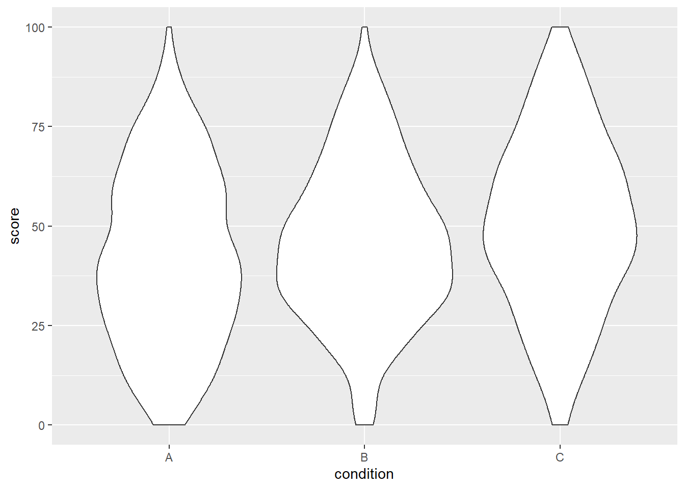
We can already see that the group means seem to increase from left to right, just as we specified above.
To make it easier to see that, we need to add a second layer, namely the means plus error bars.
ggplot doesn’t take those from the raw data, but we need to provide them by calculating and storing means and standard error ourselves.
We can then feed those calculations to the ggplot layer.
If you’re like me, you had to look up the formula for the standard error. Here it is:
\[SE = \frac{SD} {\sqrt{n}}\]
Thankfully, the summarySE command from the Rmisc by Ryan Hope calculates the SE for us, plus the 95% CI interval around the SE.
dat_summary <- summarySE(dat,
                         measurevar = "score",
                         groupvars = "condition")

dat_summary
## condition N score sd se ci
## 1 A 300 42.11566 21.97562 1.268763 2.496837
## 2 B 300 45.89995 19.77976 1.141985 2.247347
## 3 C 300 50.47729 22.07185 1.274319 2.507770Okay, now that we have the means and standard errors per group, let’s put them on top of the violins.
ggplot(dat, aes(x = condition, y = score)) +
  geom_violin() +
  geom_point(aes(y = score), data = dat_summary, color = "black") +
  geom_errorbar(aes(y = score, ymin = score - ci, ymax = score + ci),
                    color = "black", width = 0.05, data = dat_summary)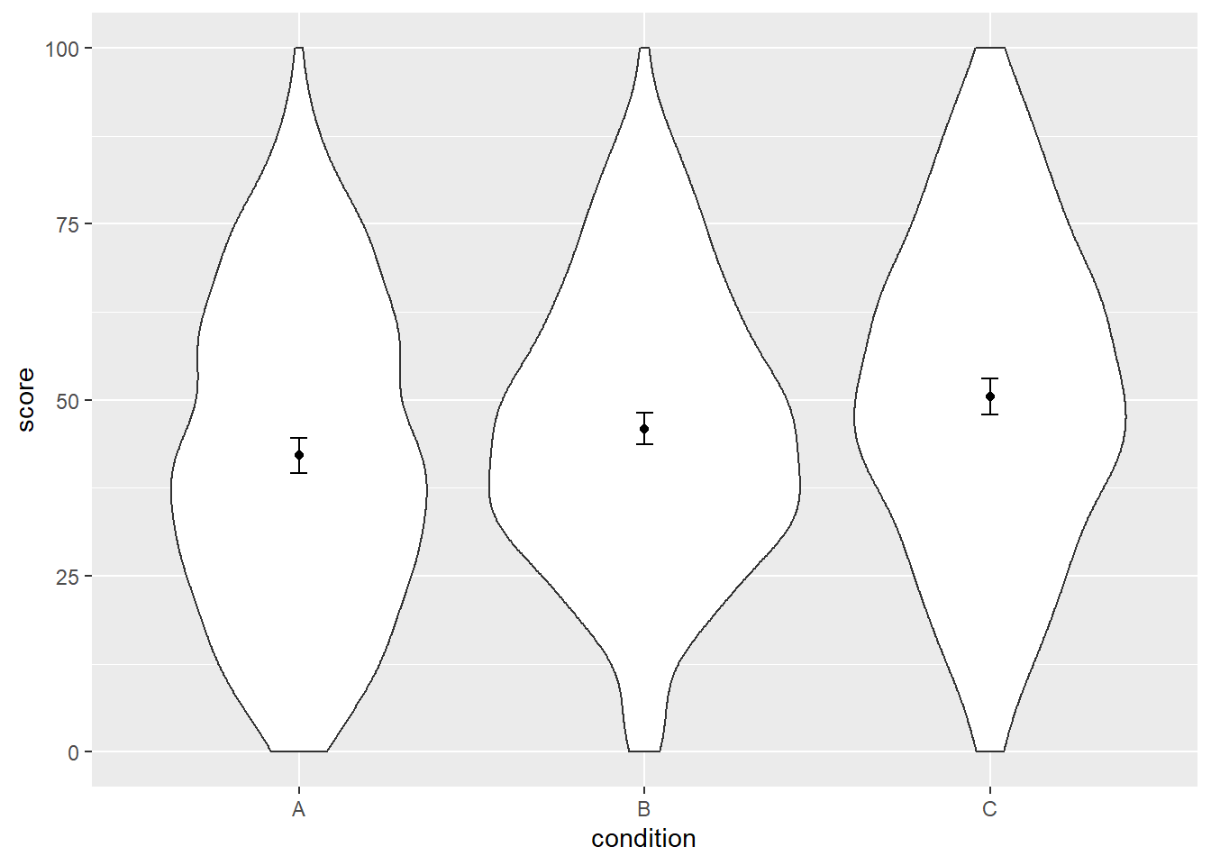
Cool, at this point it looks like we’re done. Except that we’re not.1 What’s going on?
Let’s have a look at the summary statistic again:
dat_summary## condition N score sd se ci
## 1 A 300 42.11566 21.97562 1.268763 2.496837
## 2 B 300 45.89995 19.77976 1.141985 2.247347
## 3 C 300 50.47729 22.07185 1.274319 2.507770Inspecting N shown by summarySE, we see that the summary statistics take all 300 rows per condition (30 participants x 10 trials) into account when calculating the standard error.
The formula once more:
\[SE = \frac{SD} {\sqrt{n}}\]
By increasing the denominator2, we artificially decrease the size of the SE, although we know that we don’t have 300 participants. We have 30 participants. This is crucial: we want to summarize the variability for these 30 participants, not for all observations.
This also means we should take a look at the SDs. Here’s the formula for the standard deviation:
\[SD = \sqrt{\frac{1} {N - 1} \sum_{i = 1}^{N} (x_i - \bar{x})^2}\]
Actually, the SDs we obtained from dat_summary are quite large, which makes sense because they summarize the variability of all observations – so all 300 trials per condition.
That is, the formula above is sensitive to the considerable variability within each condition that we have introduced earlier in the simulation.
Thus, the summary statistics that we calculated are not the ones we’re looking for3. We want to summarize the variability of the 30 participants per condition, not the 300 observations per condition. We need to calculate SE taking into account that we know that we have multiple measurements per participant.
Creating another plot (with error bars that’re still wrong)
Thus, we first aggregate the data, so we calculate the average score per participant.
dat_agg <- dat %>%
  group_by(pp, condition) %>%
  summarise(mean_agg = mean(score))
## `summarise()` has grouped output by 'pp'. You can override using the `.groups`
## argument.head(dat_agg, n = 10)## # A tibble: 10 × 3
## # Groups: pp [4]
## pp condition mean_agg
## <fct> <fct> <dbl>
## 1 1 A 53.4
## 2 1 B 50.6
## 3 1 C 62.7
## 4 2 A 43.0
## 5 2 B 43.0
## 6 2 C 44.7
## 7 3 A 52.5
## 8 3 B 46.7
## 9 3 C 59.8
## 10 4 A 45.3Alright, now let’s calculate the means and SE again, based on these aggregated means.
dat_summary2 <- summarySE(dat_agg,
                          measurevar = "mean_agg",
                          groupvars = "condition")

dat_summary2
## condition N mean_agg sd se ci
## 1 A 30 42.11566 9.308671 1.699523 3.475915
## 2 B 30 45.89995 7.393815 1.349920 2.760896
## 3 C 30 50.47729 9.290633 1.696230 3.469179These are different than the previous ones (except for the means, of course). Besides the correct sample size of 30, you will also note that we now have smaller SDs per condition. That makes sense, because this time we obtain the SD based on a measure per participant per condition (only 30) which is a more accurate measure than providing the SD of all observations (the full 300).
Let’s plot that one more time.
ggplot(dat, aes(x = condition, y = score)) +
  geom_violin() +
  geom_point(aes(y = mean_agg), data = dat_summary2, color = "black") +
  geom_errorbar(aes(y = mean_agg, ymin = mean_agg - ci, ymax = mean_agg + ci),
                    color = "black", width = 0.05, data = dat_summary2)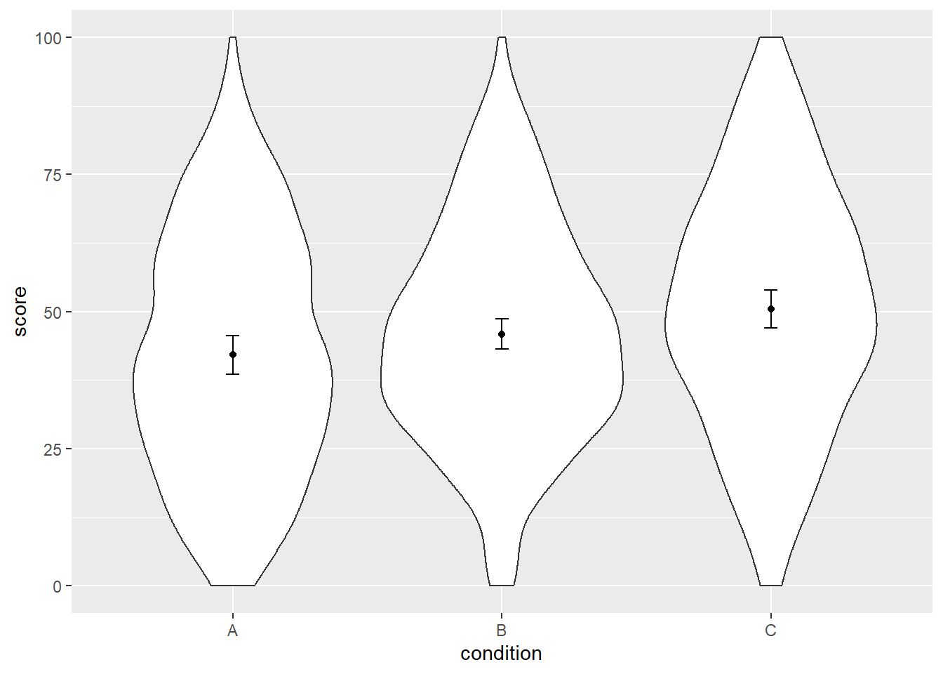
Alright, are we done? Nope. Turns out those SEs are still not entirely correct.
The last plot (this time correct)
So what’s wrong the SEs this time? If we had a between-subjects design, so if the scores for each condition came from different participants, then we’d be done. However, we have a within-subjects design, meaning we have one aggregated score per participant per condition – so each participant has multiple scores. Remember how we introduced additional variability for each participant plus random error when we simulated the data? These two sources of variability are now conflated with the difference between conditions that we’re interested in plotting. This is similar to presenting the results of an independent samples t-test rather than a paired samples t-test.
Consequently, we need a way to disentange the variability around the true difference between conditions from the variability of each participant and random error.
Thankfully, people much smarter than I have done this already.
I’m not going to pretend I understand exactly what he did, but Morey (2008) describes such a method, and Ryan Hope has implemented Morey’s method in the Rmisc package that we’ve been using in this post.
However, so far I called the summarySE function, which provides summary statistics for between-subjects designs.
In other words, I made a mistake: that function was not appropriate for our design.
Luckily, the package also has a summarySEwithin function that provides correct SEs.
Here we specify the measurement, what variable specifies the within-subjects condition, and, crucially, the variable that signals that the measurements come from the same participant.
Note that we used the data set with aggregated means.
dat_summary3 <- summarySEwithin(dat_agg,
                                measurevar = "mean_agg",
                                withinvars = "condition",
                                idvar = "pp")

dat_summary3
## condition N mean_agg sd se ci
## 1 A 30 42.11566 8.102615 1.4793284 3.025566
## 2 B 30 45.89995 5.323399 0.9719152 1.987790
## 3 C 30 50.47729 8.058000 1.4711828 3.008907Now, finally, we can create our plot with correct SE. You can decide for yourself whether you want error bars that represent the 95%CI of the SE, or whether the error bars represent one SE. I prefer plotting the 95%CI.
ggplot(dat, aes(x = condition, y = score)) +
  geom_violin() +
  geom_point(aes(y = mean_agg), data = dat_summary3, color = "black") +
  geom_errorbar(aes(y = mean_agg, ymin = mean_agg - ci, ymax = mean_agg + ci),
                    color = "black", width = 0.05, data = dat_summary2)
While we’re at it, let’s make the graph a bit prettier.
ggplot(dat, aes(x = condition, y = score)) +
  geom_violin(aes(fill = condition), color = "grey15") +
  geom_point(aes(y = mean_agg), data = dat_summary3, color = "black") +
  geom_errorbar(aes(y = mean_agg, ymin = mean_agg - ci, ymax = mean_agg + ci),
                    color = "black", width = 0.05, data = dat_summary2) +
  labs(x = "Condition", y = "Score") +
  theme_classic() +
  scale_color_grey() +
  scale_fill_grey() +
  theme(legend.position = "none",
        strip.background.x = element_blank())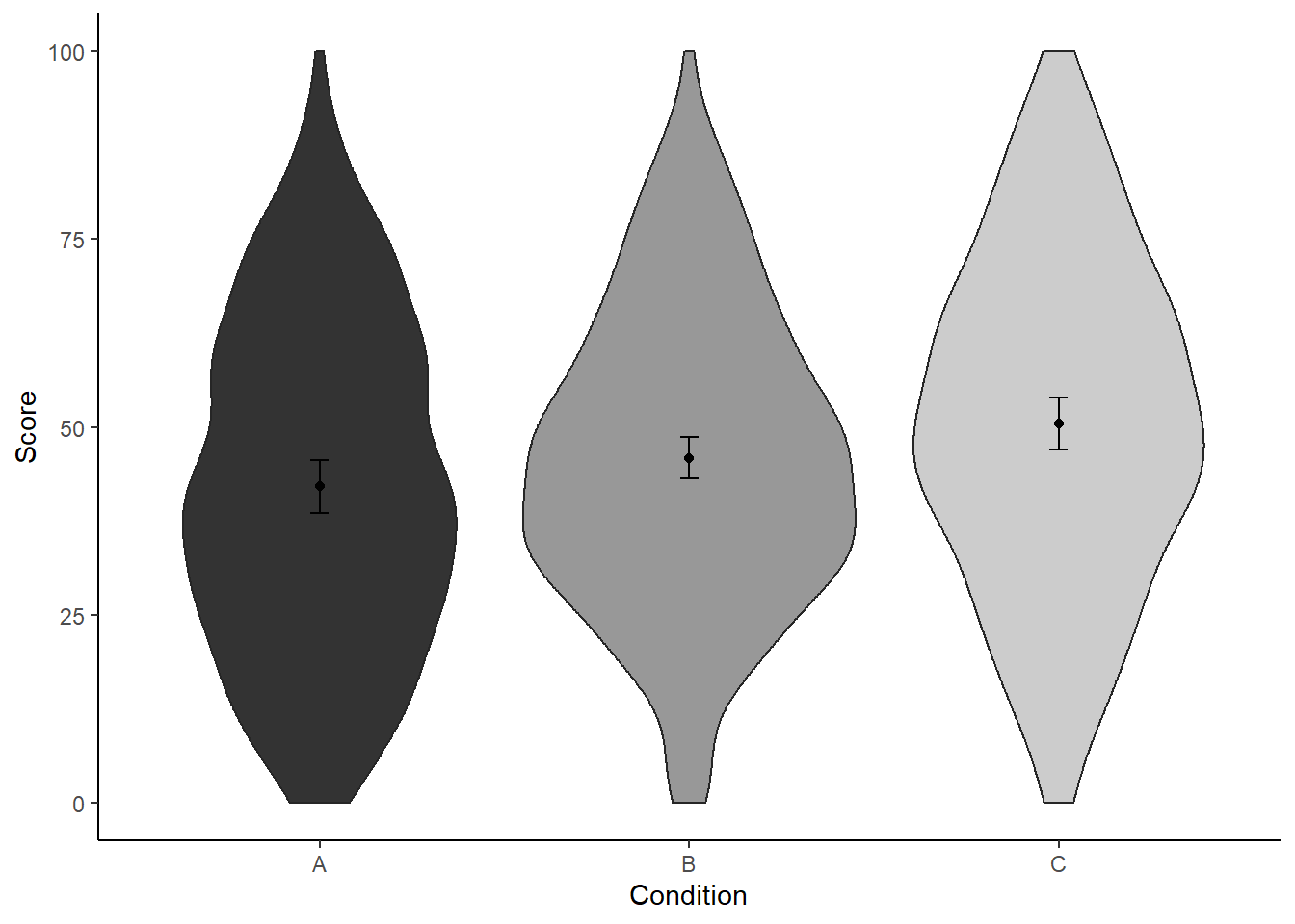
If we’d present this figure in a paper though, we should explicitly state in the figure caption what those error bars represent. After all, we’re doing something strange here: we show all of the raw data (i.e., violin plots) plus means, yet the uncertainty arround these means is not that of the raw data, but expressed taking into account the design that produced these data (i.e., within-subject design).
For example, we could write something along these lines:
Violin plots represent the distribution of the data per condition. Black points represent the means; bars of these points represent the 95% CI of the within-subject standard error (Morey, 2008), calculated with the Rmisc package (Hope, 2013).
Alright, that’s it. Thanks a lot to Dale Barr for proof reading this post and helpful feedback. If you have suggestions, spotted a mistake, or want to tell me I should stay away from R, let me know in the comments or via Twitter.